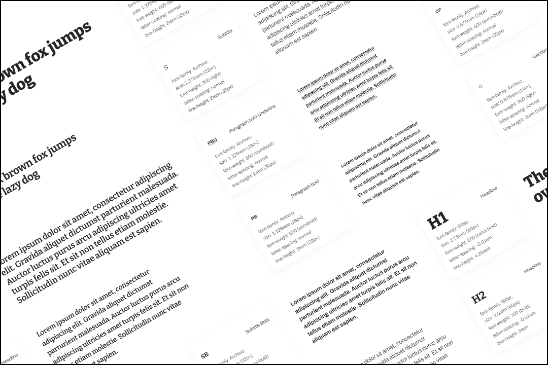
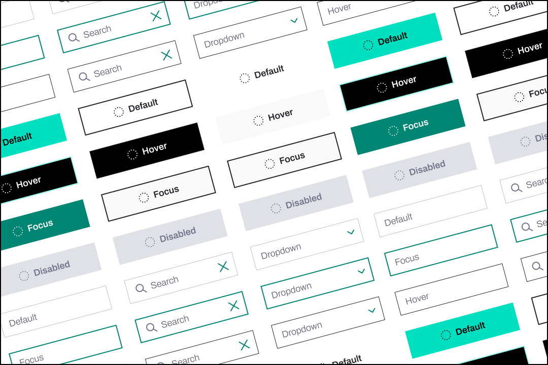
Similar to colors, typography shouldn’t be just a bunch of text styles but a solid system that is easy to apply and can incorporate changes without breaking the layouts.
Most of the developers have never used any graphic tool and many designers don’t know much about CSS/Style props and the general technical part of font rendering.
Such a situation creates an open space for miscommunication and frustration.
The designer is the very first guardian of the pixel perfect design as well as the person responsible for assuring that the layouts won’t break.
Proper communication about typography will make both sides happy. With just a little knowledge about CSS you can prepare the typography documentation in a much more reliable way.
Sweet mother of height…the line-height
Line-height property defines the space taken by a text in the rendered page. Many designers focus only on the font size, leaving the line-height property on auto. By leaving it unattended they expose the layout to be much more out of control and easier to break.
Line height in typography should be an element of a bigger UI structure that is combined of typography, grids and spacing system. If you are using a 4px or 8px grid be sure that your typography styles will follow it too. Otherwise spaces in your UI will get non intended spacings (eg. 15px instead of 16px) and the harmony will break.
Line height does reserve space in the rendered page/app element. When you change line height in your design tool, you will see that it does not affect the font’s visual size, but now the text layer occupies more space on your wireframe.
By taking care of the line height and adjusting it to the general grid system you will create a reliable layout. Imagine a situation where by any reason the original font can’t load, the device will try to fallback to another font, that font can have a different default line height and boom…everything is out of place now. Custom line-height will also help if you decide to use a system font, which is different from system to system (Android, iOS, Windows, Linux, etc.).
Add line-height value to your typography style description to allow the developer to add it to the style without any additional guessing.
Bold, Extra Bold…font-weight communication
Defining font thickness can be tricky, we are all used to selecting it by names like “Bold”, “Light”, etc. Developers can also use those properties in code but unfortunately not in every case.
For example, when there is an app created in React Native, there is no support for properties other than “normal” or “bold”. A better way to convey the weight property is to use numerical values.
Each font-weight number corresponds to a different name. Font-weight: normal can be also written as Font-weight:400. Using numerical approach does also contribute to the communication, similar to colors, it is easier to imagine the amount of reduction from 900 to 400 instead of Black to Normal.
The size does…vary. Rem vs PX.
Most of the design tools do not allow it to operate in rem sizes. That is not an excuse to not use them, the benefits are worth it!
Rem refers to “root-em” size, which defines the font-size relative to the root element. It can be specified in the CSS (changed) but by default most browsers use 16px as the default size (which can be translated to 1rem).
That is some tech lingo, forget it!
As a designer, you should understand it as it contributes greatly to the accessibility features.
By specifying sizes in pixels you do not allow your elements to be influenced by various browser features. A person with vision disabilities might set a larger font-size in the browser settings (changing the root font-size), with sizes in pixels, your UI would remain unaffected (requiring additional zoom).
Rem’s also make it easier to hold spacings intact and increase their consistency. Remember that it is ok to have some of the UI elements be specified in pixels, don’t sweat the small stuff :)
