I’ve started with understanding the users and their obstacles.In Google Analytics I’ve reviewed user journey statistics, where I’ve tried to any find suspiciously looking data (e.g. high drop-off rates).
To get more information about user behavior I reviewed Marketplace heatmaps and user journey recordings via Hotjar.
I also wanted to know if there were any suggestions or problems reported by the users. I have scheduled several meetings with Nais Customer Support employees to talk about user’s frustrations. Customer Support was also able to contact some of the client’s employees to ask them specified questions.
Nais was also measuring user satisfaction with Delighted and I’ve also included this tool in my research, where I could find user feedback added to NPS answers.
To enable more qualitative data in the research, I’ve conducted user interviews to see if any of already known problems overlap and seek additional feedback or insights.
What I’ve found at this stage:
Wrong user focus - Existing user personas were not helpful and focused too much on relatively young users (18-25 yo) while in the reality the user’s age was almost equally distributed between 24-55 years. Design solutions should acknowledge different levels of tech proficiency.
User login problems - The data from Google Analytics and Customer Support indicated that there is a problem with account activation and login process, as many of our client’s employees didn’t have e-mails or were not tech-savvy.
Low user satisfaction - General user satisfaction was not great, Net Promoter Score was 28. There were recurring complaints about problems with understanding fund spending restrictions as Nais clients have an option to provide funds as social fund (which can be spent only on specific purchases).
Redundant features - Some functionalities in the marketplace page were duplicated and were more confusing than helping the user. There were also features that almost nobody was using ( e.g. switching list view types), which only increased cognitive load for no purpose.
Lack of a price filter for the listing was frustrating users as they didn’t have an option to only see a list of vouchers they can afford.
Hard category navigation - Category names which were meant to be “exciting” for the users in reality were ambiguous and too broad. Users during interviews were struggling to correctly place given vouchers into their current categories.
Users would more likely use search than browse categories. Top 10 purchased Vouchers (e.g. IKEA, Spotify) were responsible for 80% of sales and users preferred to quickly find them rather than to explore categories and buy something new.
After directly contacting some of the users with large deposits we’ve learned that some of our clients do little to none to inform their employees about Nais and that they receive funds there.
Some of the exposed problems:
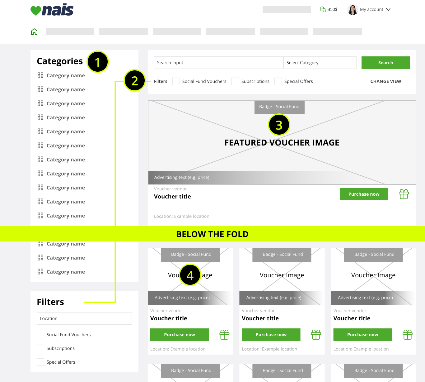
1. Hard to comprehend categories, extending below the fold (extended scrolling).
2. Duplicated & confusing filters, rarely used by the users.
3. Only one Voucher visible above the fold, increasing cognitive strain.
4. Extremely condensed voucher details, with high visual tension and cognitive overload.
To enforce the data pool about user problems I’ve also conducted UX audit to gather knowledge about issues which may not be reported by the users or visible in the quantitative data. I have reviewed the whole process of the voucher purchase (from login to order confirmation). I’ve found over 25 problems to be addressed.
Key findings:
Cognitive overload on listings - section with categories and filters was taking too much width on the desktop view, making voucher items cramped, condensing a lot of information in a small space (3 item rows) and increasing cognitive load. As the category section was not fixed, after a short scroll, user would only see blank space there and squished voucher items.
No quick scanning support for list items (Vouchers) - different information about a voucher offer details were scattered around the list item (card with image, title, details and tags). This was making it harder to quickly navigate, especially on desktop views. List items had images, but they were rarely having provider’s logo in it (e.g. Netflix) and there was no pattern to place it - users had to read list item titles or guess it from list item image to distinguish vouchers.
Voucher details page with extreme cognitive load - when a user clicked on a marketplace item, a full screen modal would open with all the details about Voucher usage and possible Voucher options (e.g. 50$, 100$ vouchers for a store). So much information in a modal resulted in additional scrolls which made the content harder to read and navigate. The solution to use a modal instead of specific page was also breaking some user flows and the information architecture because there was no direct access to it.There was no solution (just a list) for voucher options, which in extreme cases could exceed 60. A user would have to analyze every voucher option to find the interesting one (e.g. 14 locations for a restaurant voucher) which was exhausting and seriously impacting the willingness to buy one.
Order page UX issues - order page was lacking voucher option details (e.g. chosen location) and only had Voucher title and voucher option price. This could lead some users to go back to Voucher details to make them sure they are buying the right one, which might lead into dropping the purchase process. There were also several interaction issues like choosing the amount of vouchers to purchase from a dropdown (1-100)
Marketplace search efficiency - despite having a search scoring system for different voucher details (like title, provider, description, location), the scoring values were not set properly. The result was that around 60% of searches resulted in not finding the desired voucher as proper search result could only be found after sifting through many unrelated ones.
Most desired Voucher types were “hidden” - Uncontrolled sorting was additionally damaging already ambiguous categories. Often to reach a top10 voucher in its category the user would have to scroll for over a minute. This was often caused by new Voucher providers that could add over 50 list items (e.g. different gyms or activities). There was already a solution to manually adjust the list order but it was not used properly.
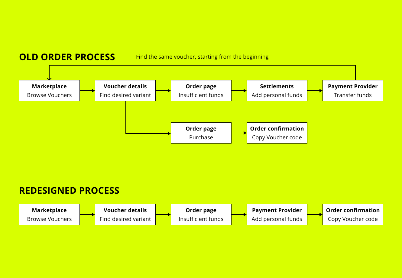
Too complex user path to deposit personal funds - Nais has the ability to deposit personal funds and use them along with the benefit ones. This solution can remarkably increase the Voucher sale levels. However the user flow requires the user to drop the purchase process and go to a different (and rarely visited) part of the system (Settlements) to deposit own money. Due to this fact, most of the users might not even know that there is an option to do this.
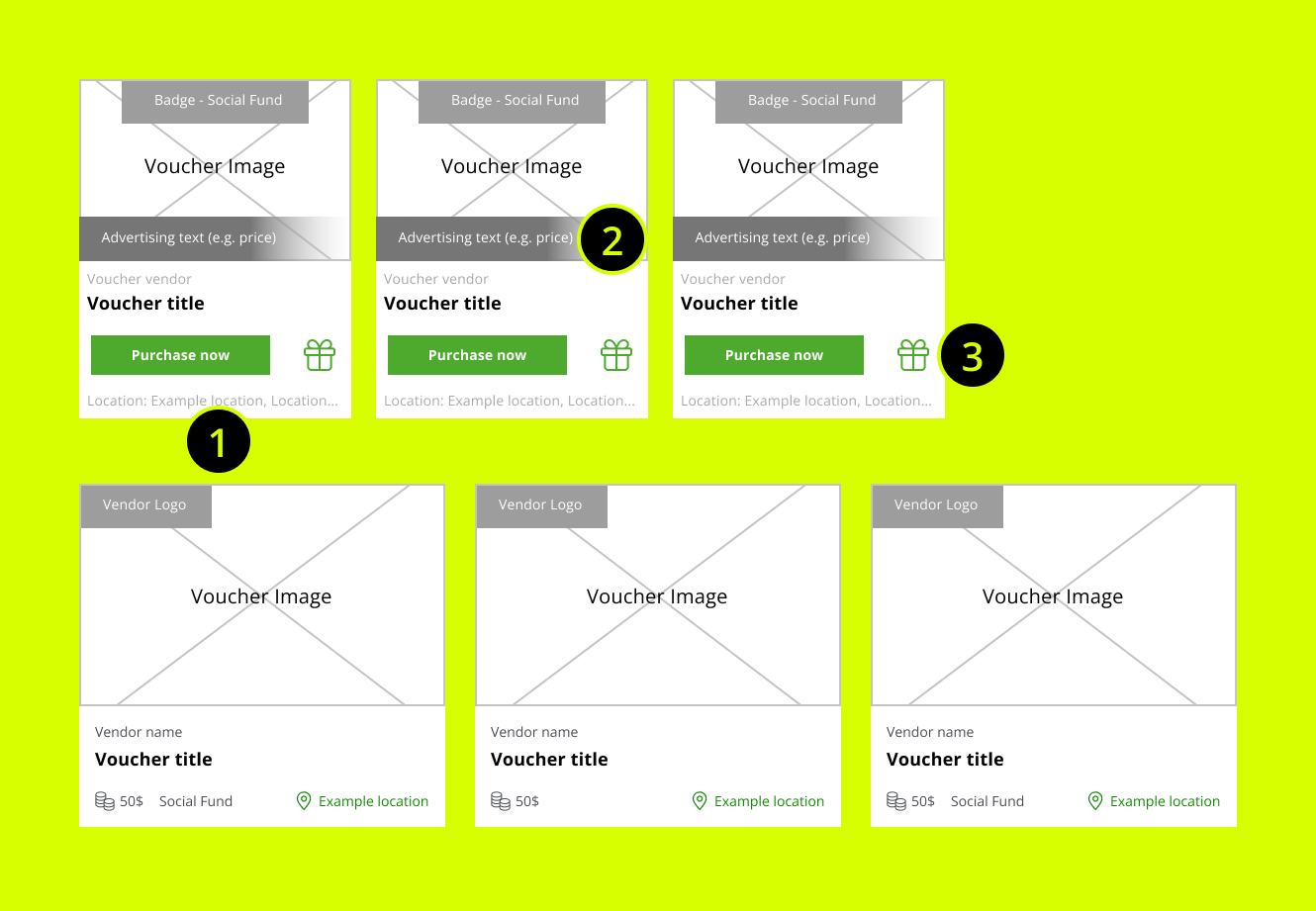
What was frustrating users in the marketplace item design?
1. No ability to preview Voucher location without entering Voucher detail page. Too low text to background contrast (hard to read)
2. No standard for quickly showing if a user can afford the purchase.
3. Confusing and useless buttons. User would end up in the same page (Voucher Details) after clicking each one, There he would choose Voucher variant and go to purchase summary (where there's an option for a gift purchase).
Solution: Clean card design serving one purpose - quickly analyze the most desired information.
It was time to sum everything up and create problem statements that would help me and my team to generate and validate ideas.
Main points to address:
Current registration and login process does not support users with low technological knowledge and their tech capabilities.
Users want to quickly find and purchase a desired voucher. Current UI & back-end solutions limit the ability to do it in an efficient way.
Some of the platform’s users don’t even know / forget that they have accounts as some of our clients (user employers) don’t put much effort into spreading the information about it.
Repairing categories
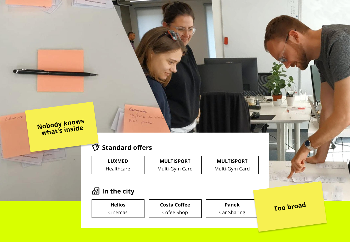
I've prepared small cards with Voucher Vendor names and their short descriptions. I was aware that it might influence the decision making process for the participants.
With over 100 vendors it was a necessity to stay focused and not waste time explaining what every Vendor is providing.
I followed with exploring problem solutions as well as their feasibility. I have discussed current user problems with different interest groups (stakeholders, IT, business and customer service). During this process I’ve been involving their representatives to take active part in generating ideas and share their experience and feedback.
Solutions for login & registration problems:
Add telephone number as an alternative to e-mail as login - users can pick registration and password reset method (email or SMS) and use telephone number to login. This will serve users struggling to use e-mails. The cost of using SMS services per user would be completely covered after just one purchase in the marketplace.
Make the system remember logged user details after logout - as many users struggled to remember their logins Nais would use cookies to store them. User would only need to
Solutions to improve purchase process
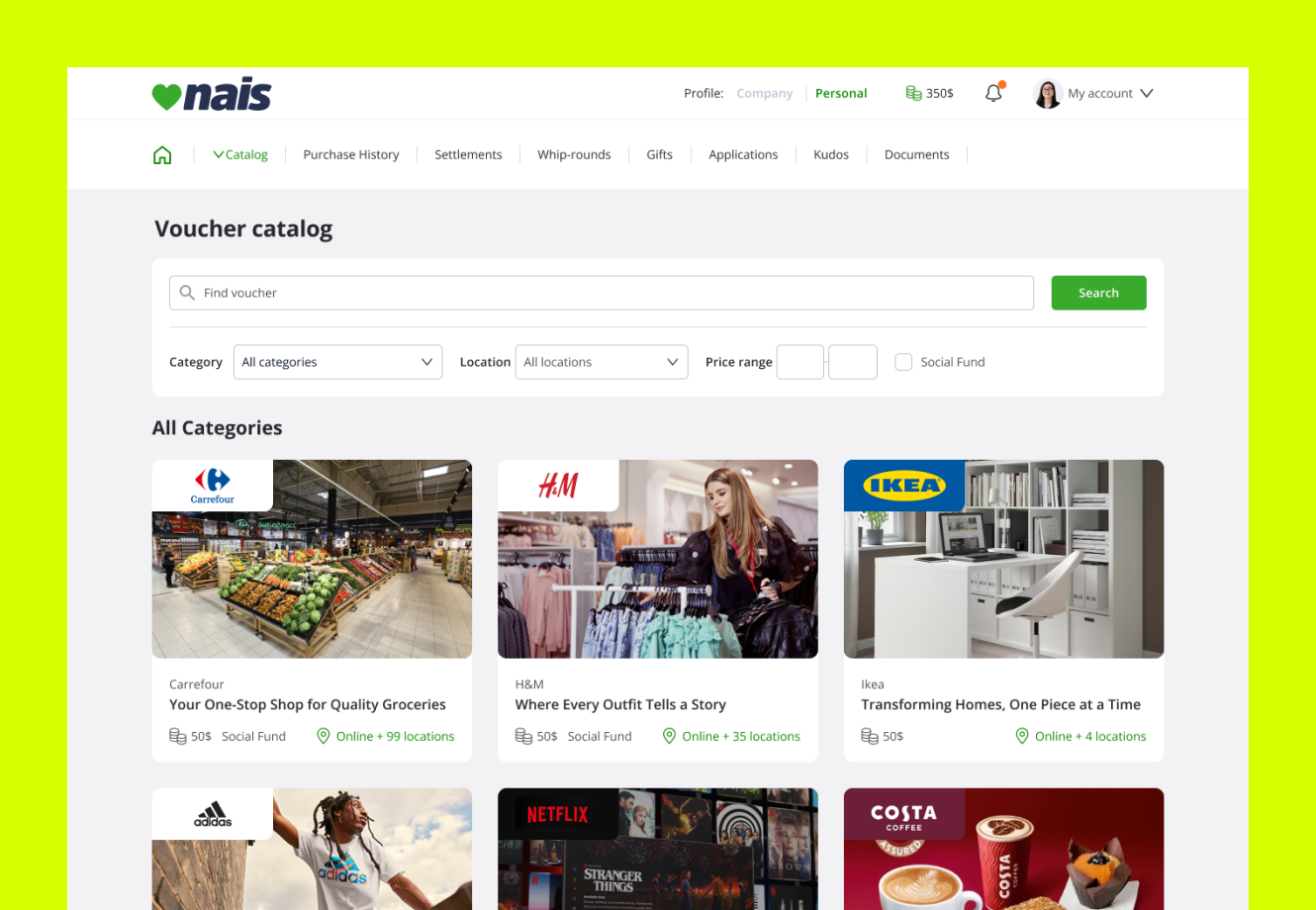
Decrease the cognitive load on listings - Duplicated filters and category section were removed. User entering marketplace can see search, filters and category select in one place. With more space unlocked with moving categories into a dropdown, Voucher items stopped being cramped and hard to analyze. Above the fold appearance also changed to show 3 most desired items in the given category instead of 1 large promotional voucher banner.
Improve search on listings - I have reviewed search engine scoring system and content structure of voucher details. After few trials and updates, search results have become accurate. Our team also worked out a prompting mechanism for search input, that allowed users to skip going into search results page and go straight into desired voucher page.
Rebuild categories based on card sorting workshop - to solve the problem with broad and ambiguous categories I’ve conducted a workshop with real users. I’ve printed out small cards containing every Voucher vendor and their service (e.g. IKEA - shopping). Together we combined cards into affinity groups and then worked on naming them.
Improve scanning ability of marketplace items - Item details were moved into one place on the card to allow easier eye scanning. To make it even easier to quickly distinguish marketplace items I have added a space for logo in the card corner, which unified the list item appearance.
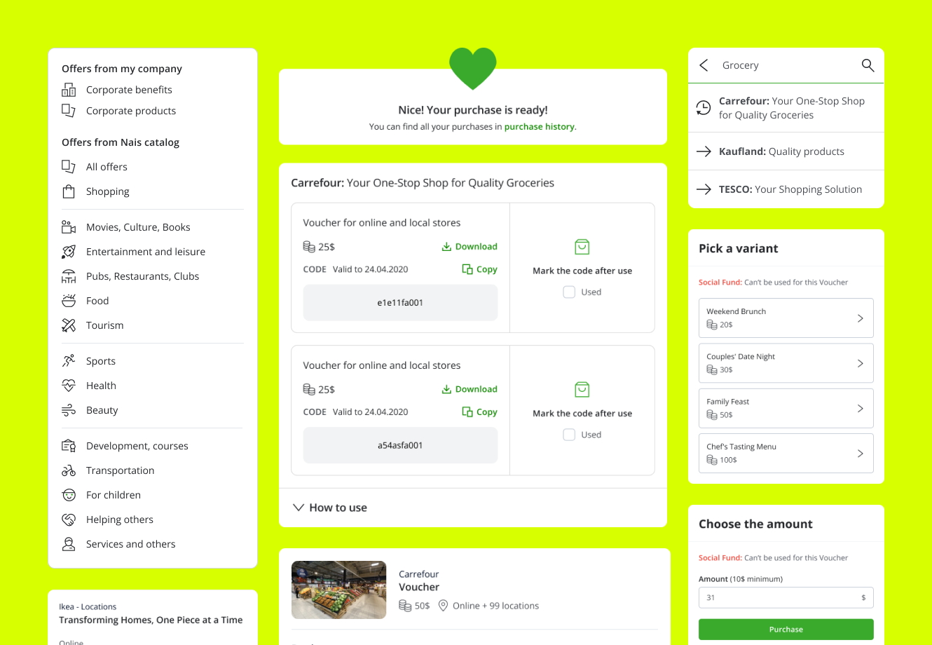
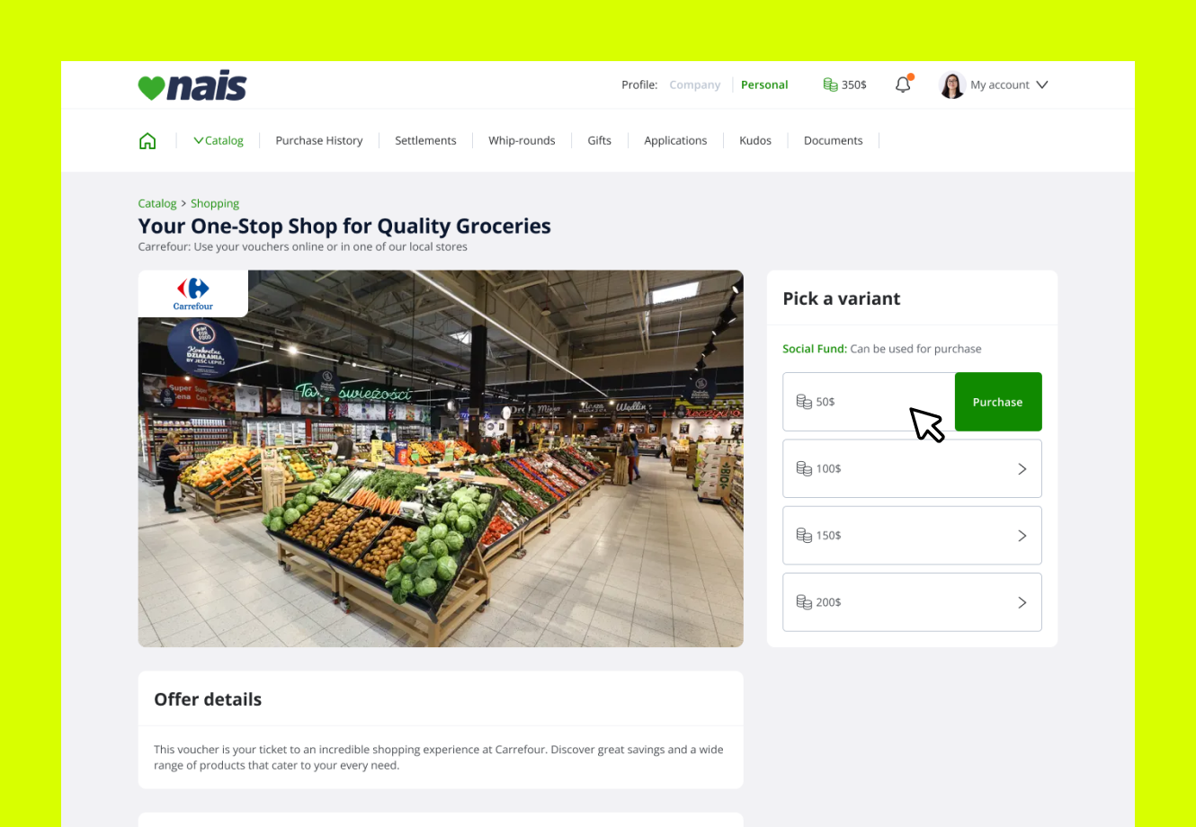
Move voucher details from modal into a standalone page - this decision allowed users to see unobstructed voucher details without the need of excessive scrolling. In the modal solution, accidental click might have closed it - causing user frustration. Moving to a dedicated page improved responsiveness of the page, especially for the mobile views.
Reduce cognitive load on voucher options - Working closely with back-end developers, we pointed out most common patterns for voucher options and picked those types that can require user to compare 20+ options. It turned out that the most problematic type of option was the location. We designed a feature to move options for the same location (e.g. 50$ / 100$ / 300$ dinner in Warsaw) and show only city selection in the first step. In the most severe case a user would not be overwhelmed by a list of 60+ items but see only a list of 12 cities when entering Voucher details page. Additionally for every list having more than 10 items the user would be able to use quick search to filter the list. Voucher option item also had it’s price as a part of a title (entered by hand) which was prone to human error and not coherent (e.g. “50$ Dinner”, “Large dinner 150$”). In the new design price is separated from the title and in the same place for every voucher option item.
Add a quick solution to cover missing funds during Voucher process - system will show information that the current account balance is not enough to cover the purchase but the user can use personal funds to cover the remaining part. The flow doesn’t require to go to any other place to deposit funds and the payment is a part of the process resulting in user ending in order confirmation page with purchased voucher.
Solutions for off-line Nais promotion and improve account activation
Prepare educational materials for managers - to allow them instantly answer most common account activation questions from their employees. Printed materials would also be distributed to clients with largest inactive employee account levels. We have worked closely with the clients to establish understanding of how crucial the initial support from the manager side is to spread the information about the platform.
Nais Promoters On-site - We’ve also added an option for our clients to organize educational days in their workplaces, where our Customer Service would be answering employee questions on-site as well as help them register.
Improving user flows
A user with insufficient funds would be informed about the possibility of using personal funds to cover the remaining part. However there was no additional information where to do this (or a link). The process required to go to different part of the system and add funds there, then find again the desired voucher.
The new process keeps the user in the purchase process with the "Add funds & Pay" option.
With this project I’ve introduced interactive prototypes to Nais (Figma) to show the every party involved in the production process the impact of early testing and gathering feedback about proposed solutions.
Before my arrival the production process had a waterfall approach with designer mostly focusing on wireframe creation, without any user testing before development.
After involving different people during previous stages, I’ve been able to build the common understanding and appreciation of the value of design thinking.
I’ve gathered prototype feedback from internal workshops and interviews with active Nais users. Every prototype solution was positively received with only minor tweaks reported.
I was not able to test everything without it being created (e.g. SMS login, influence of promotional materials), for these type of solutions we had to rely only on the data gathered in the research phase and do informed decisions based on their potential.
Redesigned list view
Only the desired filters were left, list items are easy to comprehend due to information reordering and wider row space. The main point of focus are the vouchers (versus categories and filters in previous design).
The list of improvements was long, so we had to prioritize and cut the process into steps. This allowed us to be more agile and have space to improve other parts of the platform.
With properly created design system and priority on reusable components I was able to reduce the general development time. I worked closely with the devs to ensure proper delivery and smooth hand-off process.
Phase I (lower involvement of back-end devs) - redesign marketplace catalog and voucher details page. Improve search. Rebuild categories. Prepare promotional materials. We’ve been able to deliver a lot of improvements for every Nais user, which would also take advantage of the next phases.
Phase II - Login / Registration / Password reset with SMS functionalities. With already improved user flow around the marketplace it was time to allow easier access to the platform for
Phase III - Add option to quickly cover missing funds for purchase. This solution involved developing additional logic to work with our payment provider API and it’s use would be situational. That’s why we decided to do it last.
Redesigned Voucher details page
Navigation issues were resolved with having a dedicated page in the place of a modal. Previously users would have to use a modal scroll to see the voucher variants. Now they are instantly visible in the above the fold area.
Voucher Marketplace was the main Nais module at that time and the only way to appreciate an employee (send benefit funds to spend on vouchers). Nais Voucher Sale Provision profits were barely growing (under 5% y/y). User Satisfaction was average at most.
Due to product’s specificity (e.g. large portion of users save funds for Christmas) it is best to compare results year to year

I’ve been the only designer (later promoted to Product Leader) at Nais for almost 3 years, during that time we’ve experienced:
Growth of Voucher Sales started to double every year. Improved user experience did contribute to this success as user base grew by 30% avg. y/y.
Net Promoter Score rise by 78% from 28 to 45.
Satisfied employees built trust of Nais clients to the platform, some of which increased their benefit budgets.
Average Voucher Sale Provision amount fell - but it’s actually a good indicator. The top Voucher providers have by default lower reseller provision rates. Nais strategy was initially to promote less desired Vouchers with higher sale provision rates. It was a dead end as it didn’t benefit the users and also Nais profits (resources used to advertise them). Increased volume of sales allowed Nais to renegotiate provision terms with top providers. In general, the easier a user can find and purchase what he wants, the more profit can be generated in the long term.